Beauty & lifestyle
Shishis
Shishis, London.
- Role
- Identity & direction
- Sector
- Beauty
- Deliverables
- Brand kit, social
Scope
- Brand identity
- Colour & typography
- Social direction
Overview
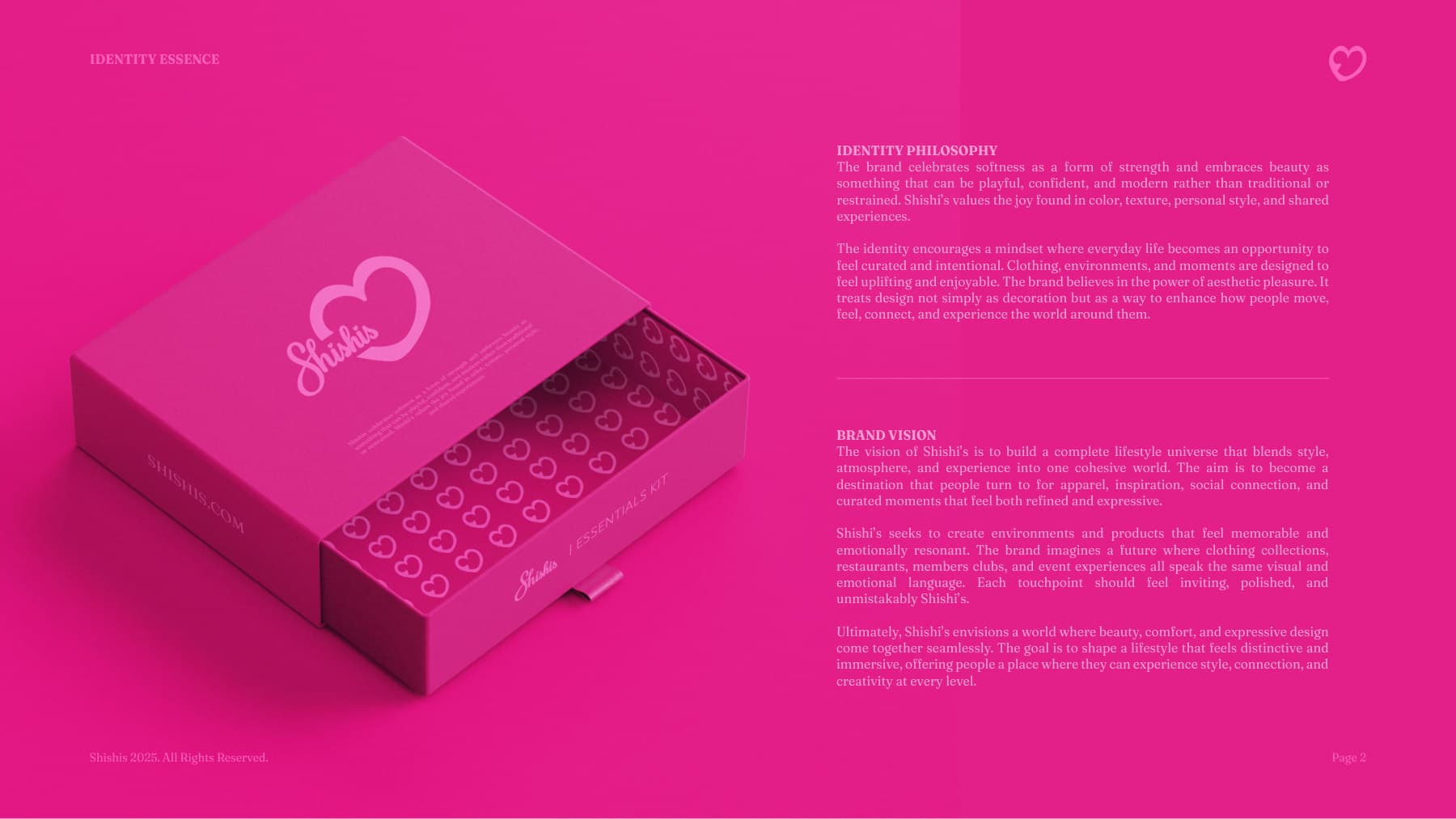
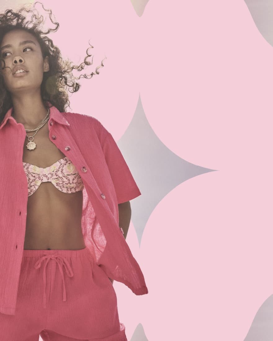
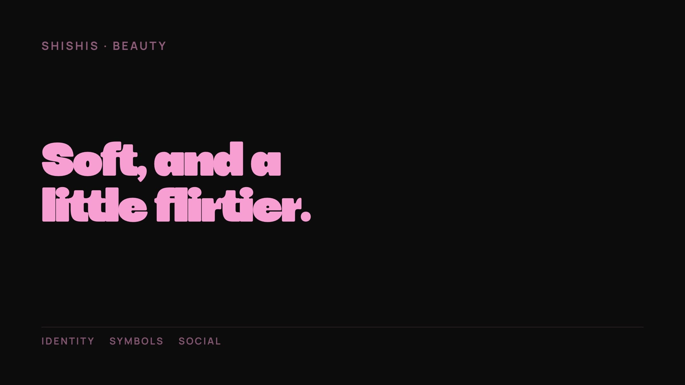
Femininity, softness, and a bolder, flirtier edge.
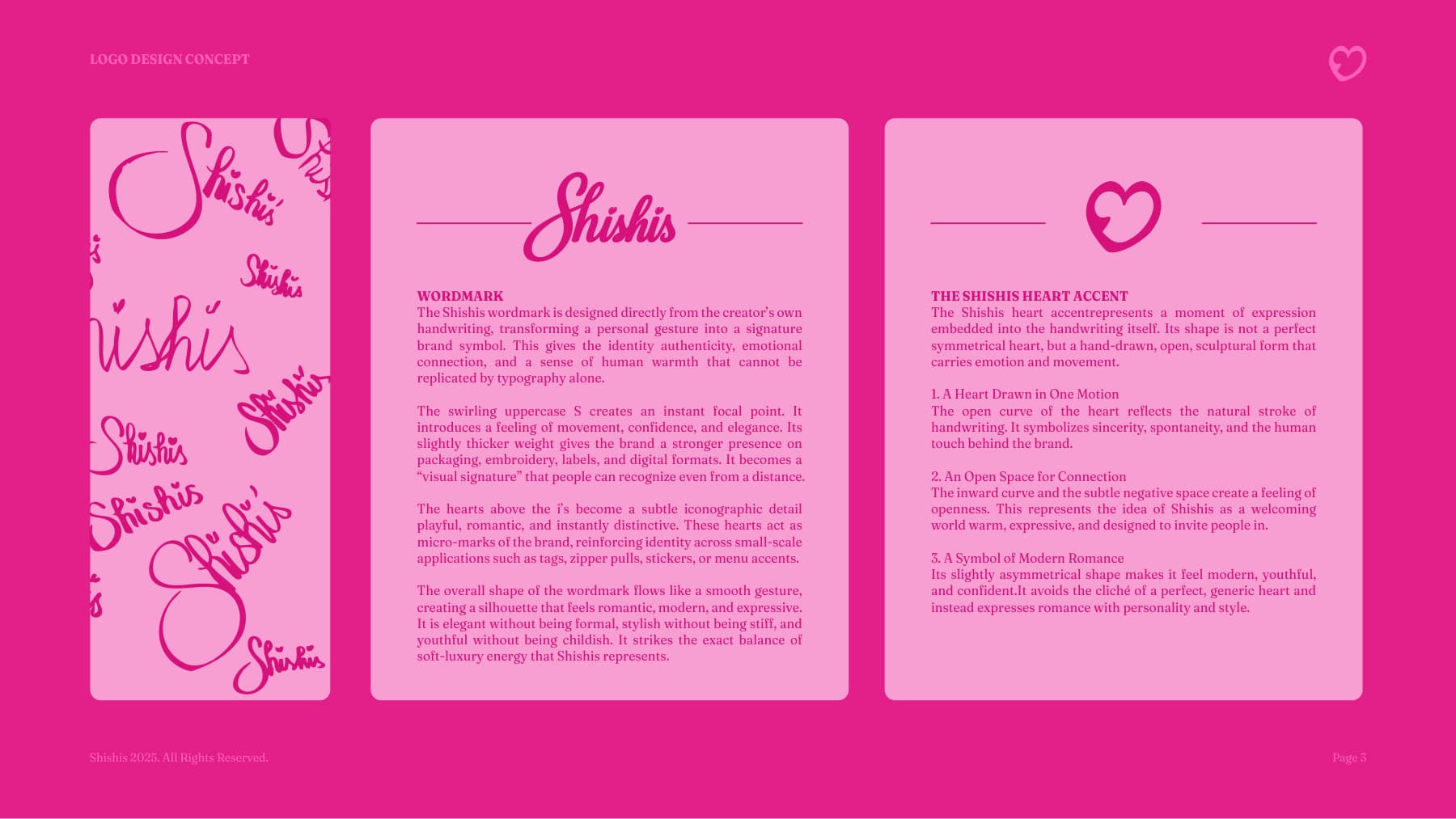
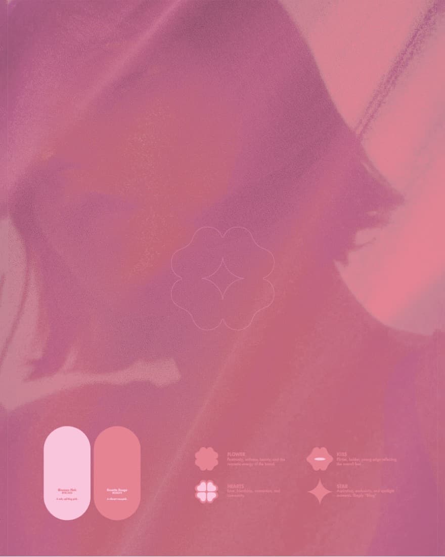
A playful display identity built on an expressive pink palette — Blossom Pink and Rosette Rouge — with a symbol set of flower, heart, kiss and star that flexes across product, packaging and feed.
Identity system
How the brand is built.
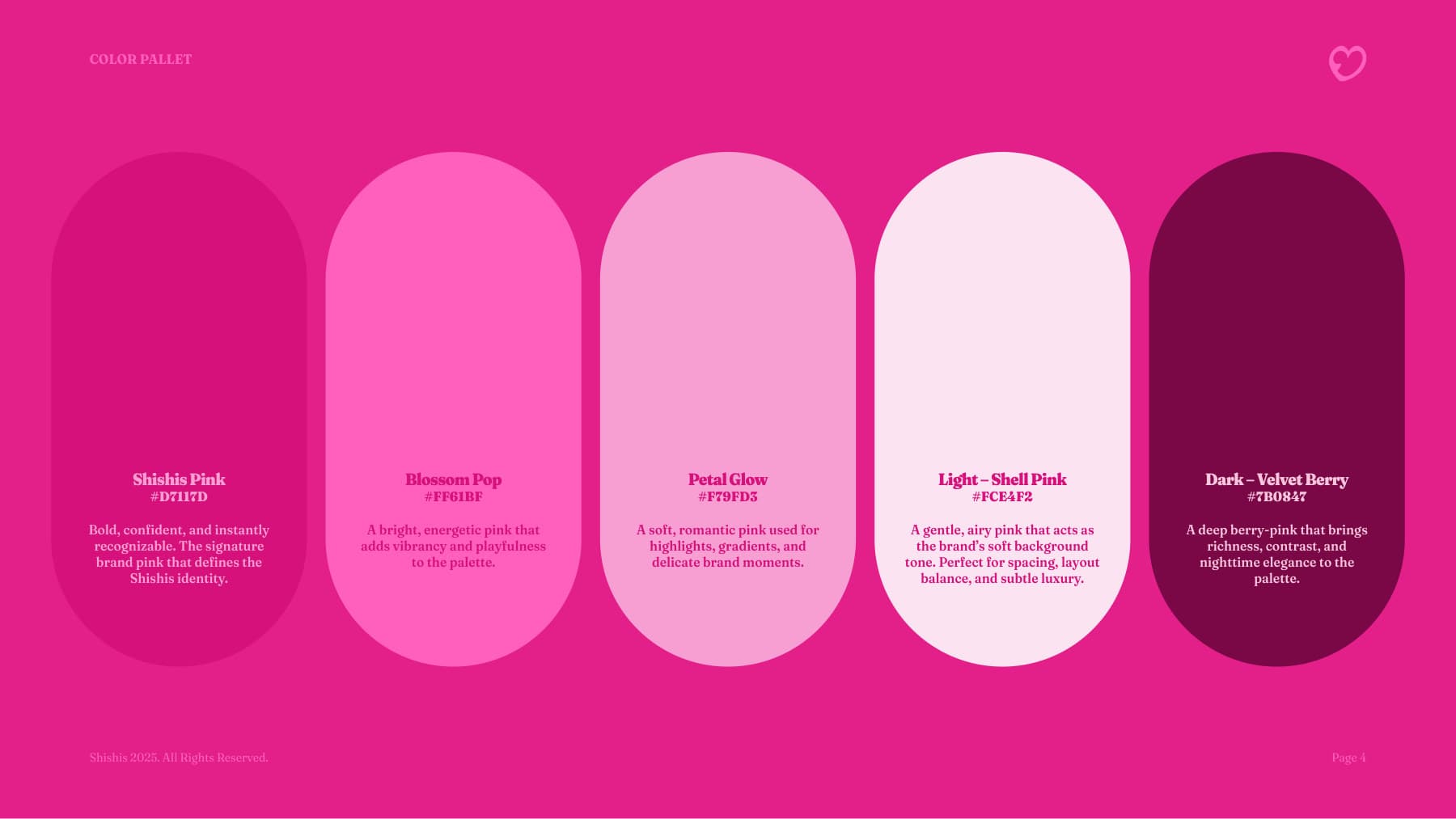
Colour
- Shishis PinkThe pure brand pink that defines the identity#D7117D
- Blossom PopAdds vibrancy and playfulness#FF61BF
- Petal GlowAccents, gradients and delicate moments#F79FD3
- Shell PinkLight — spacing and layout balance#FCE4F2
- Velvet BerryDark — subtle luxury and depth#7B0847
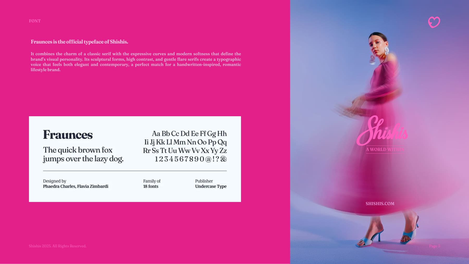
Typography
Chunko BoldDisplay typeface
Motifs & meaning
- Flower
- Femininity, softness, beauty, and the romantic energy of the brand.
- Hearts
- Love, friendship, connection, and community.
- Kiss
- A flirtier, bolder, young edge reflecting the overall feel.
- Star
- Aspiration, exclusivity, and spotlight moments.
The work
8 pieces