Circular fashion
The Shared Bag
Redefining consumption norms.
- Role
- Identity & campaign
- Sector
- Fashion
- Deliverables
- Brand kit, campaign, social
Scope
- Brand identity
- Symbolism system
- Campaign
- Social
Overview
Pushing circularity forward.
The Shared Bag is a creative collective, a movement, and a challenge to the status quo of fashion. It thrives at the intersection of sustainability, community and innovation, redefining what it means to engage with clothing and consumption — empowering communities to transform waste into opportunities.
The one bold move
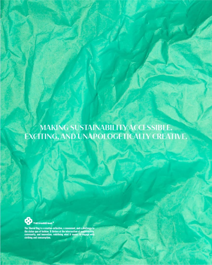
Making sustainability accessible, exciting, and unapologetically creative.
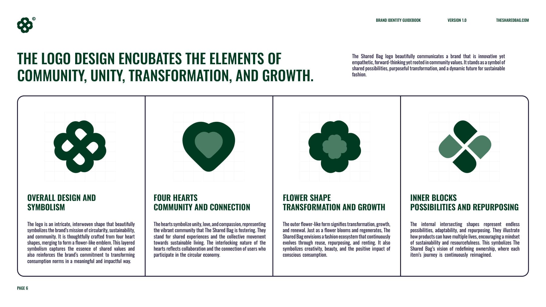
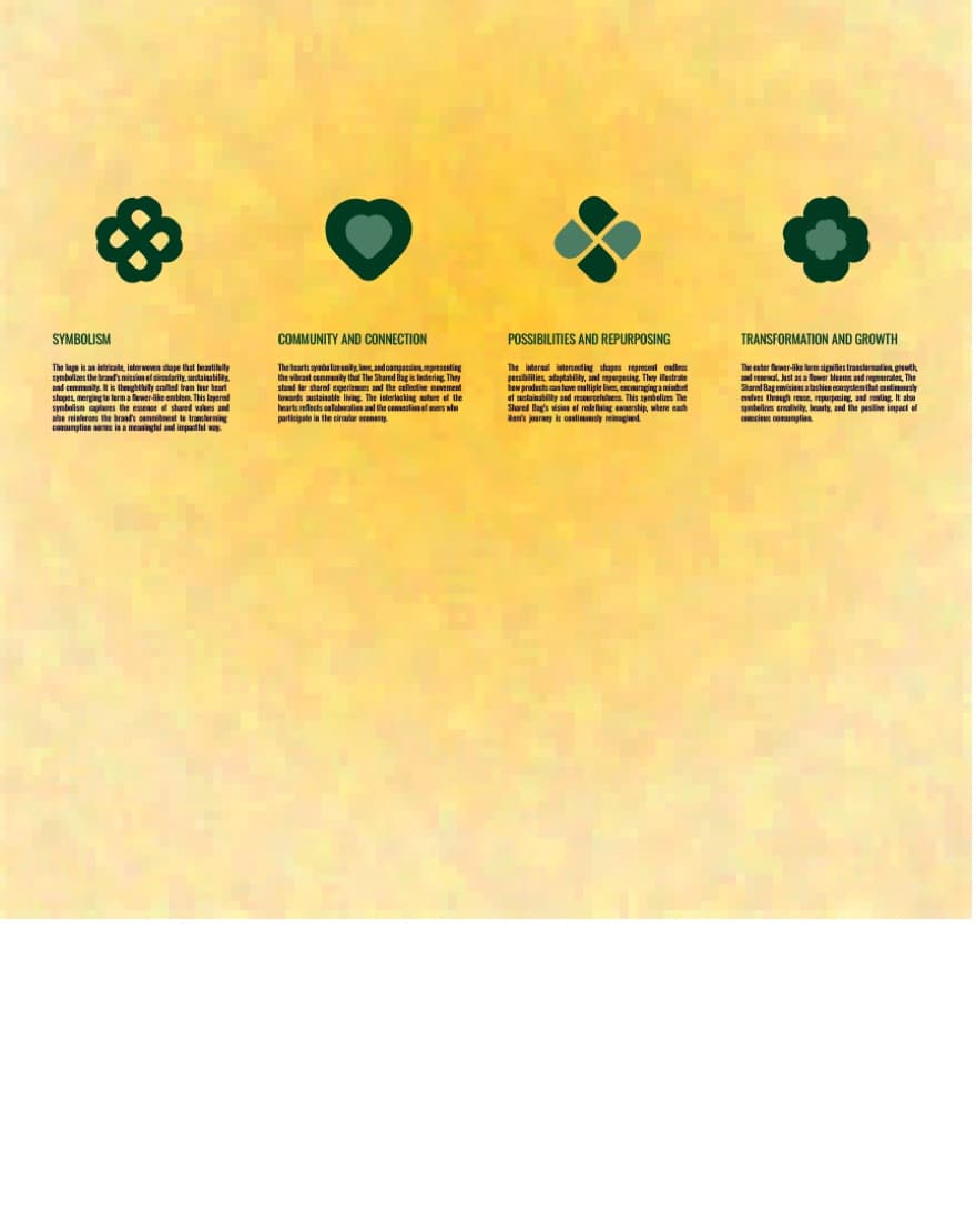
Four heart forms merge into a flower-like emblem. The hearts carry community and connection; the intersecting shapes within stand for endless possibility, adaptability and repurposing; the blooming outer form signals transformation, growth and renewal.
Identity system
How the brand is built.
Symbolism
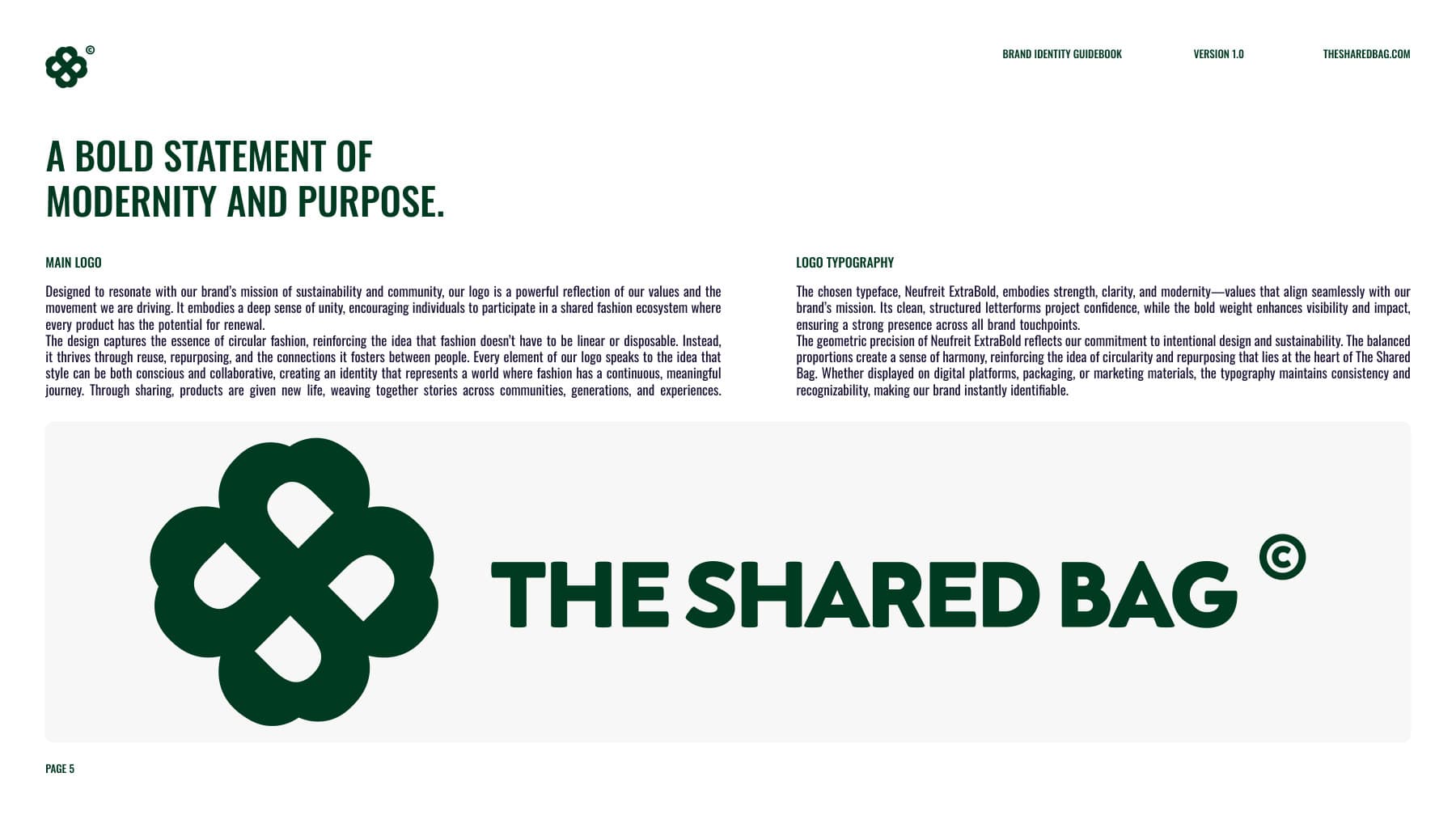
The logo is an intricate, interwoven shape that symbolises the brand's mission of circularity, sustainability and community. It is thoughtfully crafted from four heart shapes, merging to form a flower-like emblem — layered symbolism that captures shared values and reinforces the commitment to transforming consumption norms.
Colour
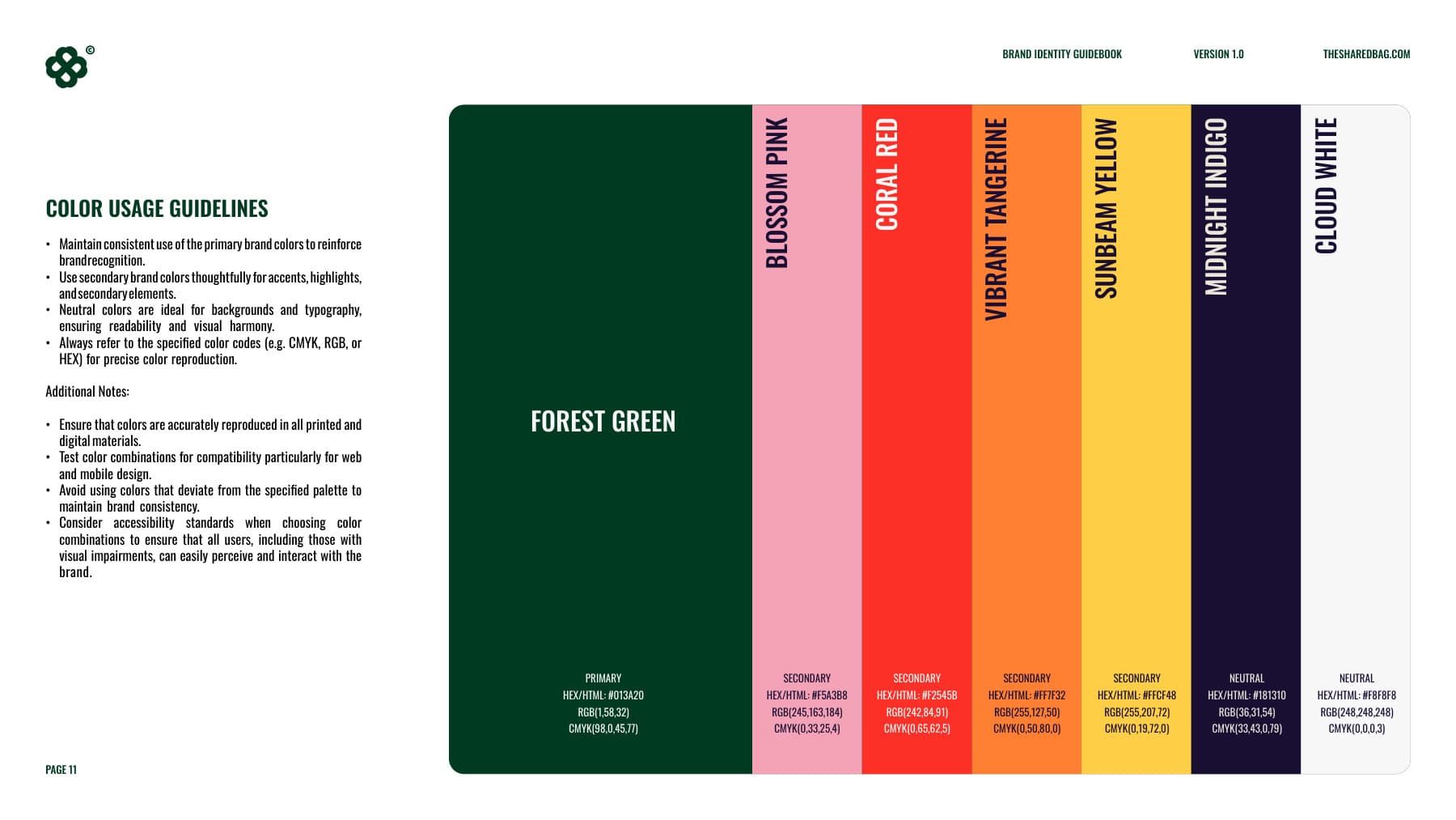
- Forest GreenPrimary#013A20
- Vibrant TangerineSecondary#FF7F32
- Sun YellowSecondary#FFCF48
- Coral RedSecondary#F2545B
- Soft PinkSecondary#F5A3B8
- Off WhiteNeutral#F8F8F8
- Near BlackNeutral#181310
Typography
Neufreit ExtraBoldDisplay typeface
Embodies strength, clarity and a modern edge, breaking away from conventional styles to deliver a fresh, confident voice.
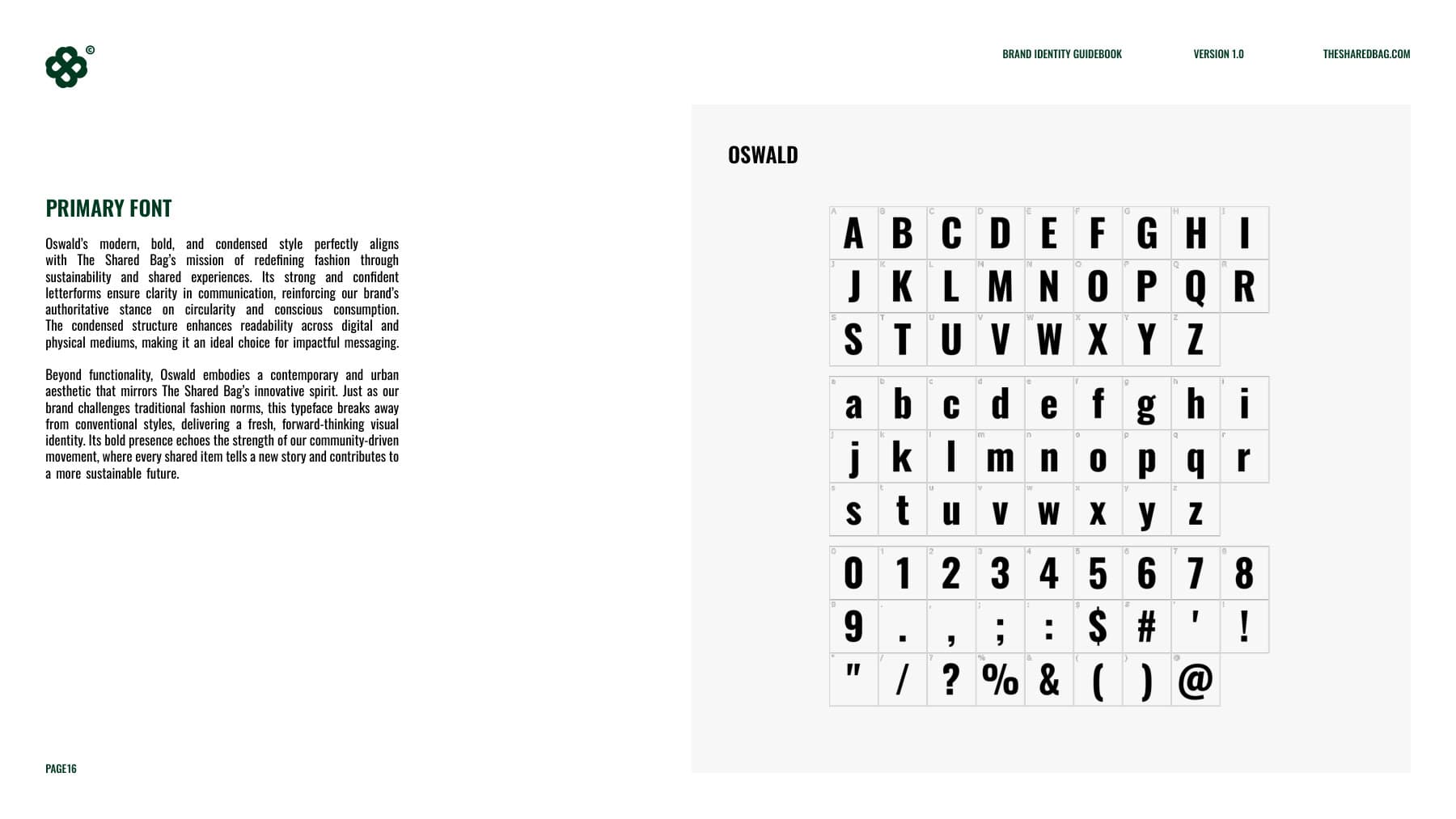
OswaldSupporting typeface
Motifs & meaning
- Community and connection
- The hearts symbolise unity, love and compassion, representing the vibrant community the brand is fostering. Their interlocking nature reflects collaboration between users who participate in the circular economy.
- Possibilities and repurposing
- The internal intersecting shapes represent endless possibilities, adaptability and repurposing — how products can have multiple lives, encouraging a mindset of resourcefulness.
- Transformation and growth
- The outer flower-like form signifies transformation, growth and renewal. Just as a flower blooms and regenerates, the brand envisions a fashion ecosystem that continuously evolves through reuse, repurposing and renting.
The work
13 pieces