Felicità
- Role
- Identity & art direction
- Sector
- Jewellery
- Timeline
- 14 days
- Deliverables
- Brand kit, packaging, campaign, website
- Year
- 2026
- Brand strategy
- Logo system
- Colour & typography
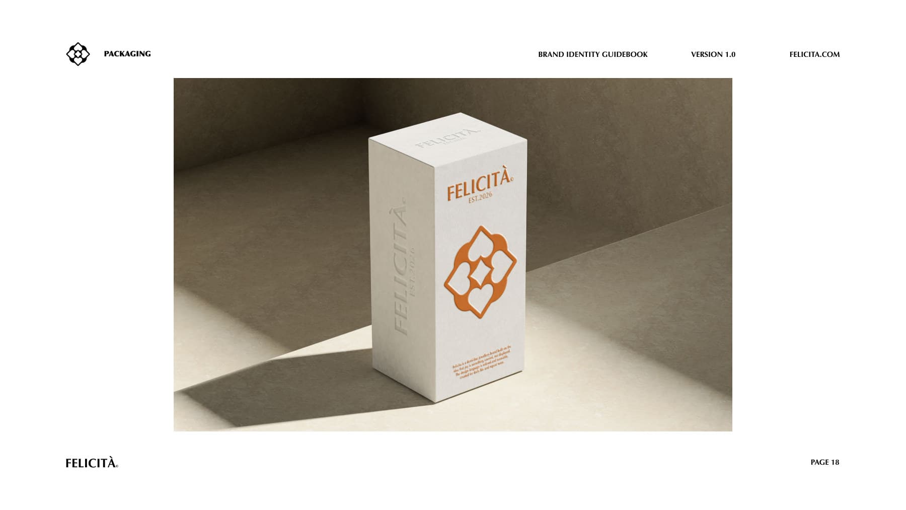
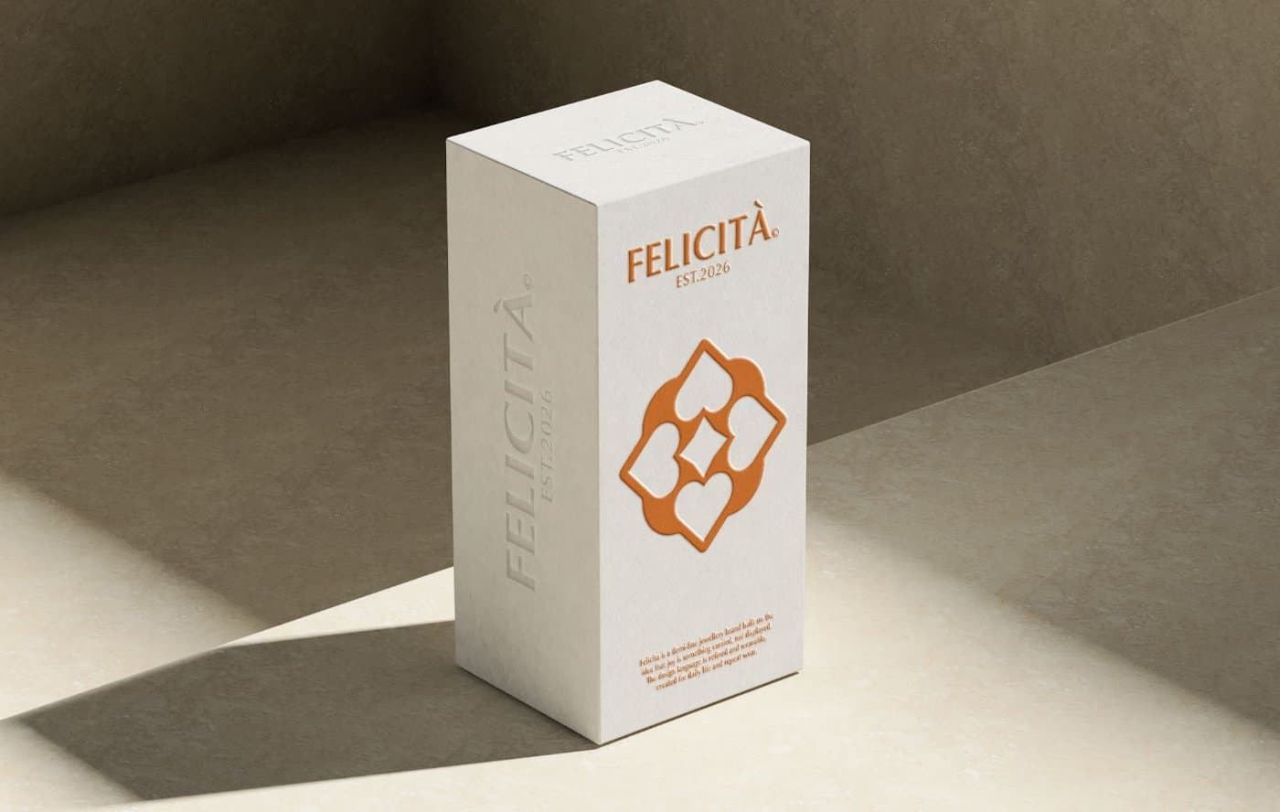
- Packaging
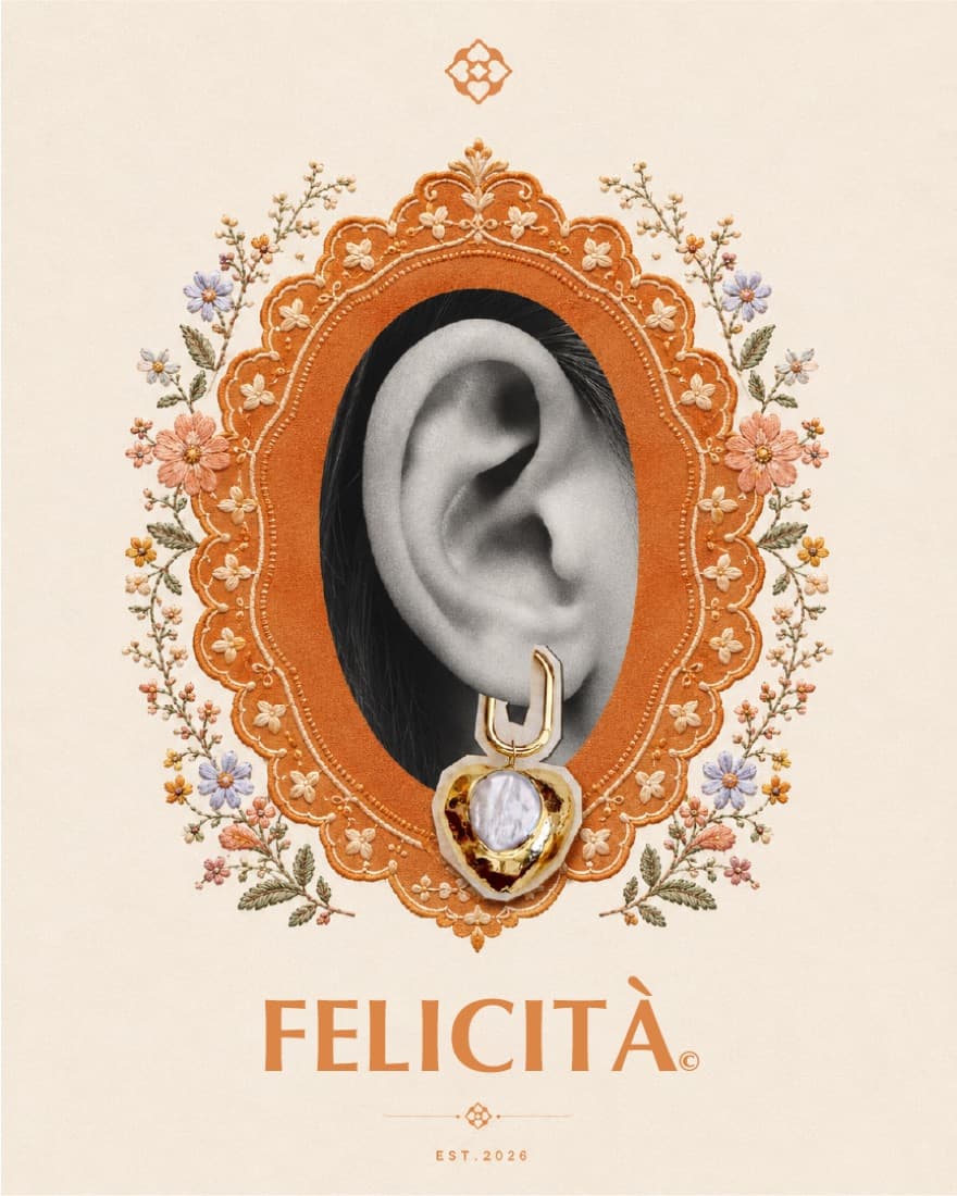
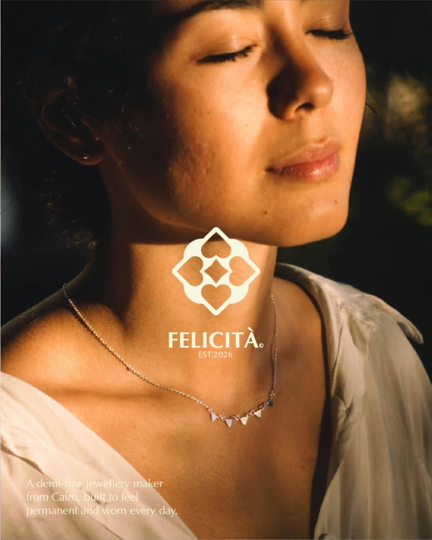
- Campaign art direction
- Website
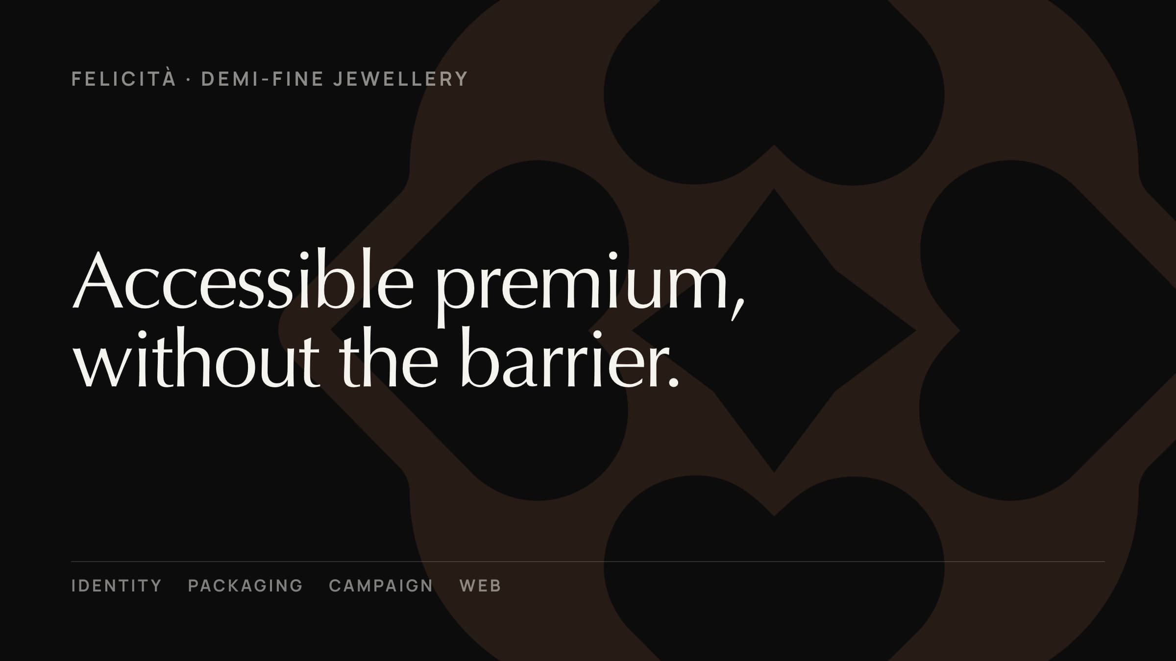
Accessible premium, without the fine-jewellery barrier.
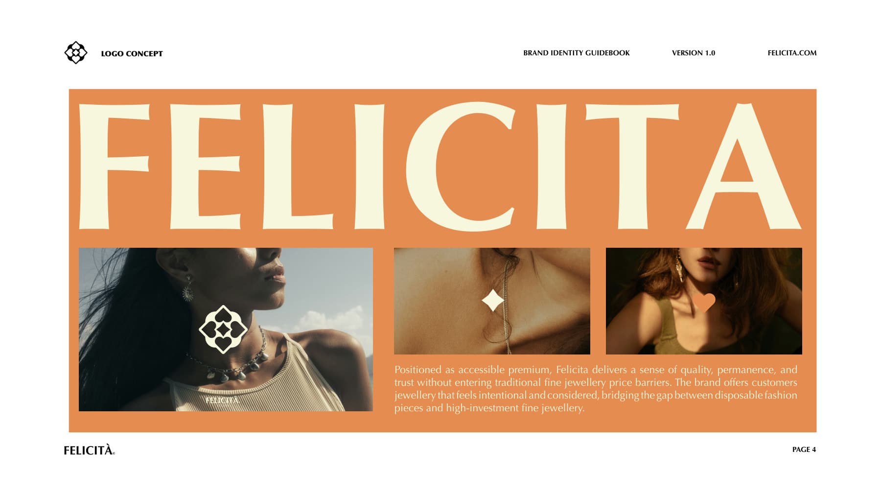
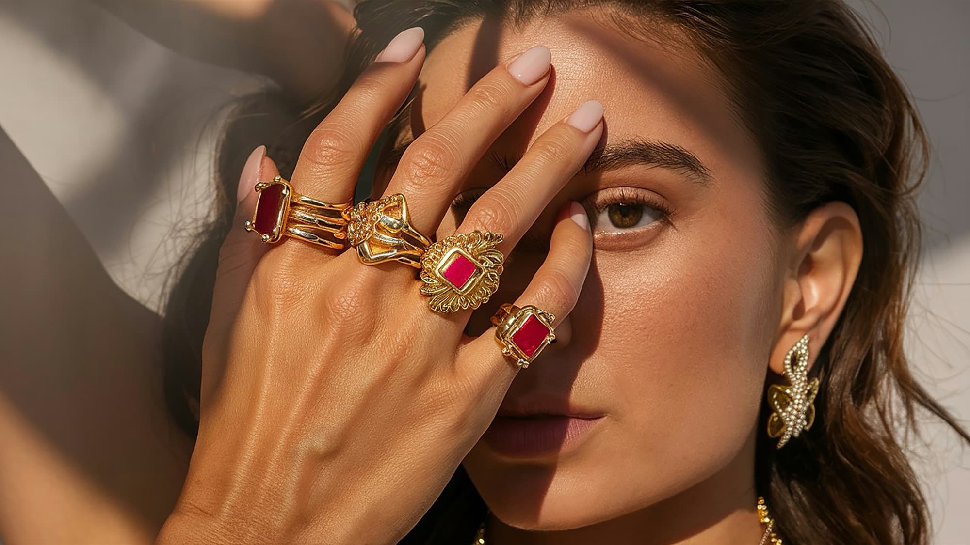
Felicità is a demi-fine jewellery brand designed for daily wear, consistency, and long-term use. It operates in the space between fine jewellery and fashion jewellery, addressing a clear functional gap in the market: jewellery that is elevated enough to feel permanent, yet practical enough to be worn every day. Positioned as accessible premium, it delivers quality, permanence and trust without entering traditional fine-jewellery price barriers.
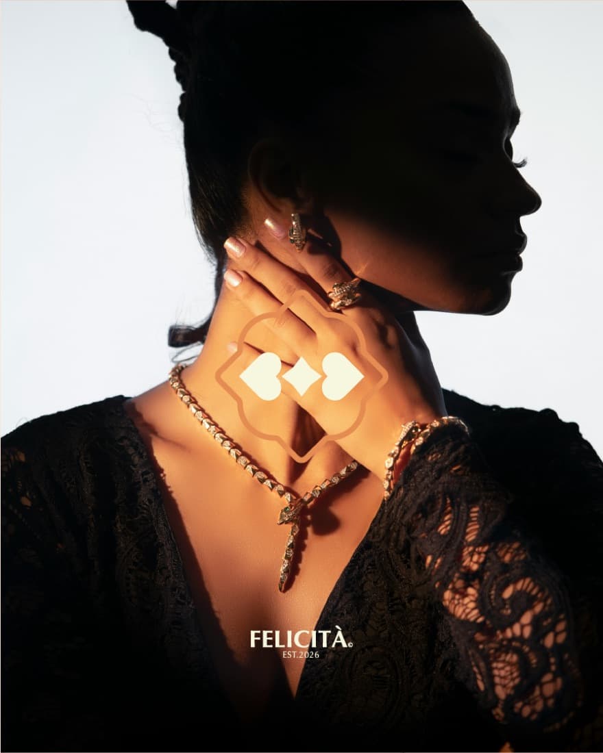
A quatrefoil built from hearts, spades and a central star.
How the brand is built.
Primary wordmark
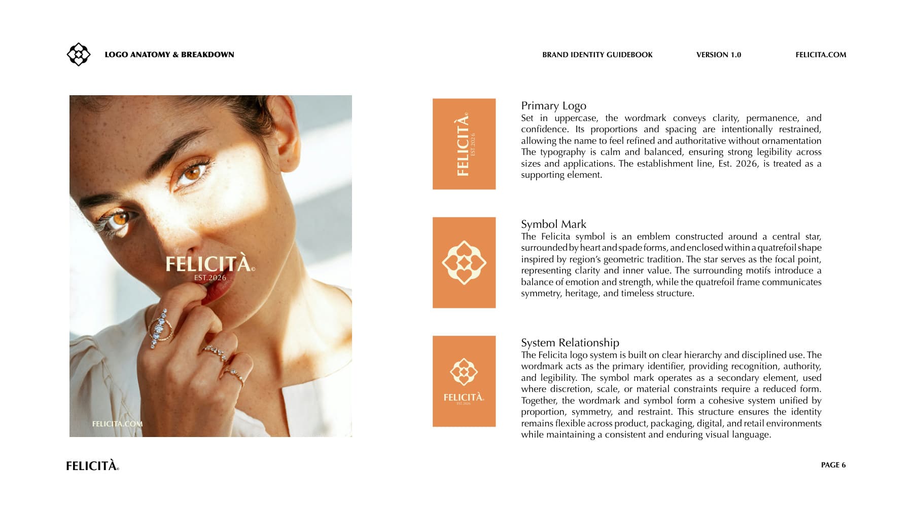
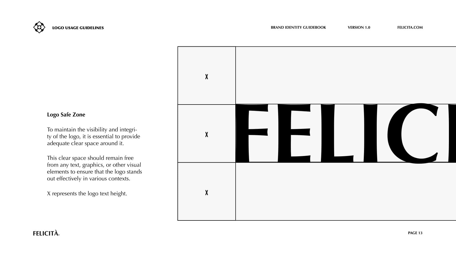
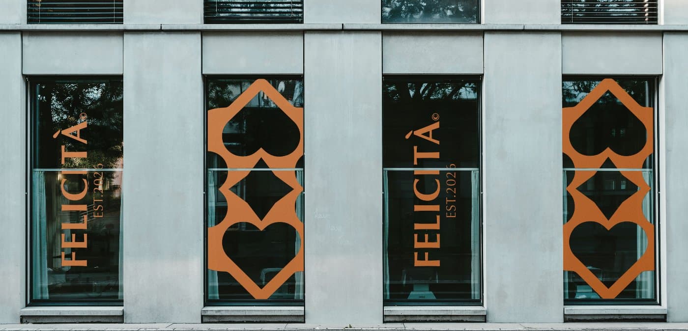
Set in uppercase, the wordmark conveys clarity, permanence and confidence. Its proportions and spacing are intentionally restrained, letting the name feel refined and authoritative without ornamentation. The establishment line, Est. 2026, is treated as a supporting element.
Symbol mark
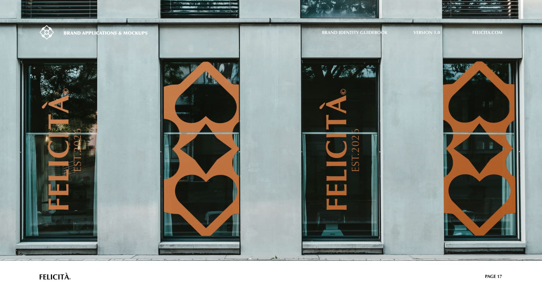
An emblem constructed around a central star, surrounded by heart and spade forms and enclosed within a quatrefoil inspired by the region's geometric tradition. The star represents clarity and inner value; the surrounding motifs introduce a balance of emotion and strength; the frame communicates symmetry, heritage and timeless structure.
System relationship
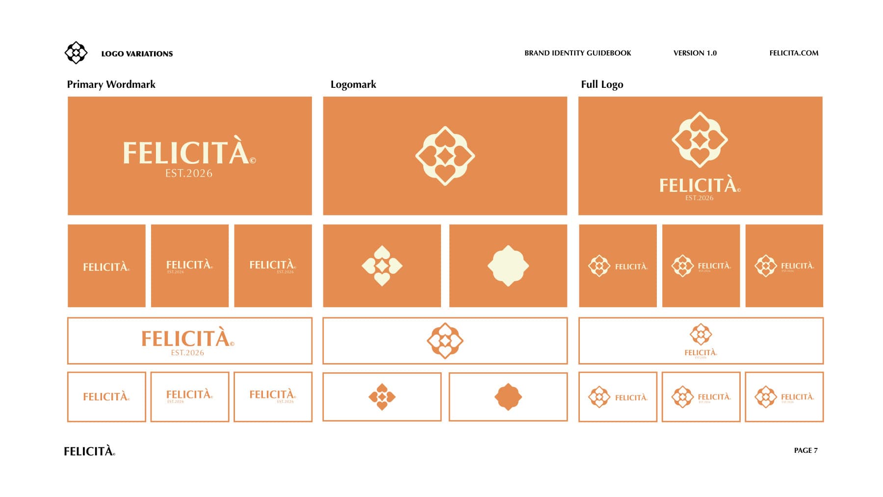
The wordmark is the primary identifier, carrying recognition and legibility. The symbol operates as a secondary element where discretion, scale or material constraints require a reduced form. Together they are unified by proportion, symmetry and restraint.
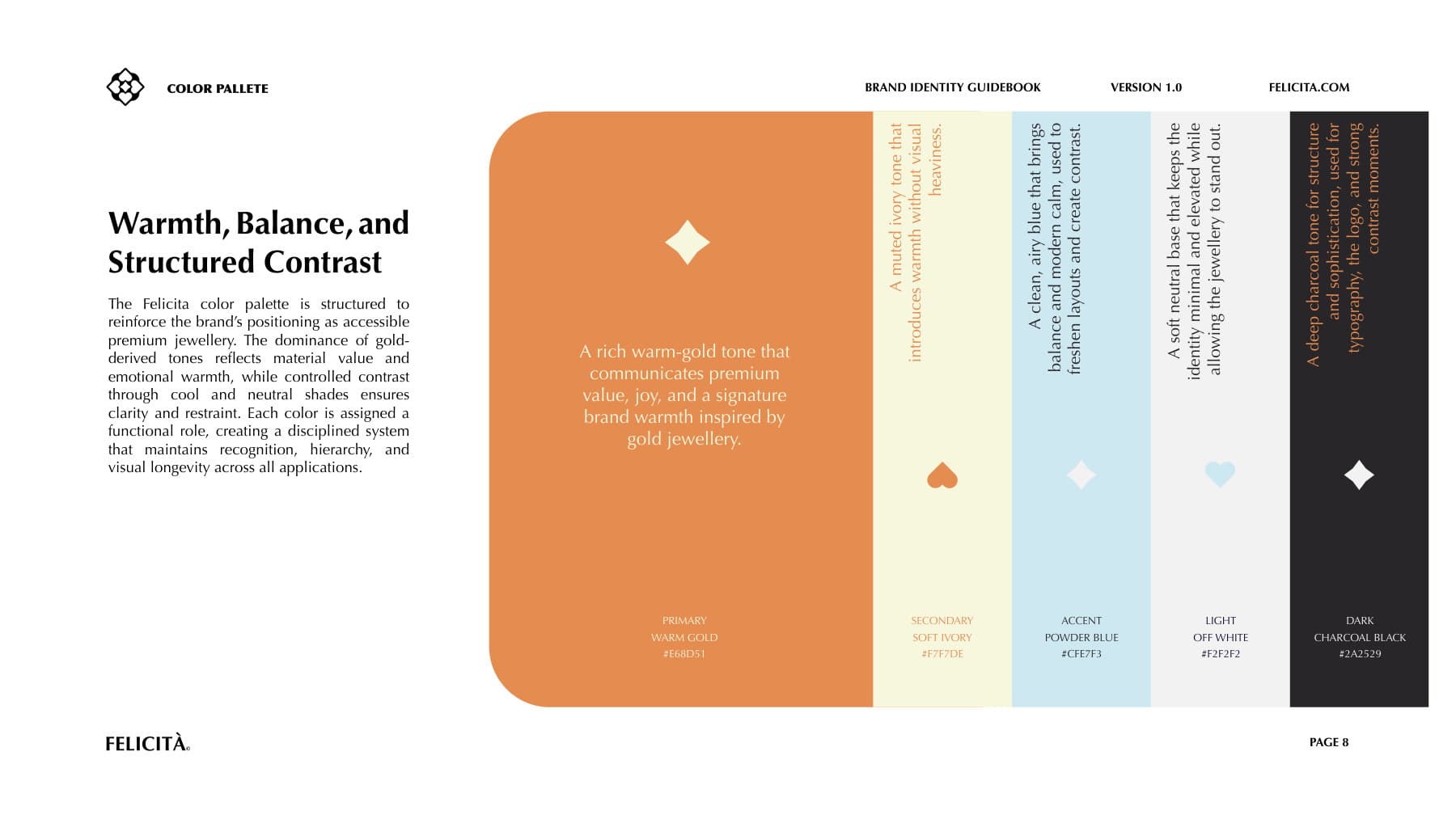
- Warm GoldPrimary — premium value and brand warmth#E68D51
- Charcoal BlackStructure — typography and high contrast#2A2529
- Off WhiteFoundation — the default background#F2F2F2
- Soft IvorySecondary — warmth without weight#F7F7DE
- Powder BlueAccent — controlled contrast, used sparingly#CFE7F3
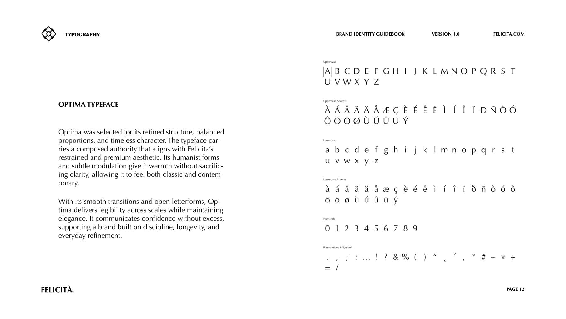
Selected for its refined structure, balanced proportions and timeless character. Its humanist forms and subtle modulation give it warmth without sacrificing clarity, delivering legibility across scales while staying elegant.
- Star
- The focal point: clarity and inner value.
- Heart & spade
- A balance of emotion and strength.
- Quatrefoil frame
- Symmetry, heritage and timeless structure.
The work
17 pieces